Summary – A top-down review of interesting calls and comments made last week about monetary policy, economics, stocks, bonds & commodities. TACs is our acronym for Tweets, Articles, & Clips – our basic inputs for this article.
Editor’s Note: In this series of articles, we include important or interesting Tweets, Articles, Video Clips with our comments. This is an article that expresses our personal opinions about comments made on Television, Tweeter, and in Print. It is NOT intended to provide any investment advice of any type whatsoever. No one should base any investing decisions or conclusions based on anything written in or inferred from this article. Macro Viewpoints & its affiliates expressly disclaim all liability in respect to actions taken based on any or all of the information in this article. Investing is a serious matter and all investment decisions should only be taken after a detailed discussion with your investment advisor and should be subject to your objectives, suitability requirements and risk tolerance
1. Generosity of Fridays
Remember the week before? Thanks to the data, the Fed & Chair Yellen, treasury yields were rising inexorably that week prompting dire warnings of higher yields ahead. Then came the big rally in Treasury prices and steep fall in yields on Friday, September 19.
This week was similar. Thursday’s decline of 264 points in the Dow, & the break of 1967-1969 in the S&P, prompted dire warnings of a larger downdraft. Then came the 167 point rally on this past Friday and all of a sudden, the mood improved & the future didn’t look so bleak:
- Friday – Bespoke @bespokeinvest Nasdaq has re-taken its 50-day for the time being. Look for a close above as a positive short-term reading.
The sharp Treasury rally on Friday, September 19, continued this week with TLT rising 1.2% and the 30-year yield falling 7 bps this week. So will the sharp rally of this Friday continue into next week?
The entire treasury curve rallied this week and the 30-10 yr spread fell by 5 bps to 142 bps & 30-5 yr spread fell by 2 bps to 69 bps. This is a steep flattening given the 30-10 yr spread remained above 100 bps through the entire duration of QE. The 30-10 year spread is probably one of the best indicators of inflation expectations receding. This bears out the view of many that slowdown in Europe & China is a large factor in the bull-flattening of the treasury curve .
2. Russian Bear & European Beef
Jim Cramer called it right, in our opinion, on Tuesday on his SOTS show:
- “It is Russia – It all started with Russia, we could have been up today with that Chinese PMI, it was OK, but we are looking at a self-inflicted wound between the tensions in Western Europe & Russia, as it gets colder, all I hear about over and over again, is Gazprom shutting down the west? Europe is powered by natural gas and natural gas comes from Russia; if they dont get a settlement here, tensions continue, then Europe does go down minus 1, minus 2; that means China – the reverberations – the commodities are world wide; the bear market is not there, the bear market is in commodities;”
And Cramer also uttered the “2007” term we thought he would not utter again:
- “we are in a bear market for commodities; its begun in the last few weeks, it accelerated
yesterday, the fact that Oil is up 60 cents despite a potential major disruption in the Middle East, copper was off gigantically yesterday, these are all signs of a worldwide slowdown, if there isn’t a deal between Russia and Europe, then Europe is indeed going to slip into a very serious recession, this one self-inflicted, the Chinese comments resonated through out the world, we are starting to see new signs, oil is slowing, truck building is slowing, we have aerospace rolling over, when the commodity complex rolls over, it reminds people very much of August 2007 period when we began to see … a bear market in commodities”
Bob Kaiser of S&P Capital IQ echoed these comments about Europe:
- “Draghi admitted today that the European growth scenario is unwinding faster than anybody thought, if you start to see sovereign CDS spreads move higher, could be more downside on the risk-off trade if that starts to develop”
Paul Richards has been a fan of Draghi all year. But he sounded a different tune on Tuesday on CNBC FM 1/2:
- “you look at Draghi, he has got nothing, the LTRO was not taken up well last week, ABS is
definitely a start but I think he has a really big problem bringing QE in, and he is screaming
for reform from Europe; I mean in a democratic environment there, I don’t see that happening, that leaves him with one thing, the currency like Japan , I think Europe is going to have to export their way out of the problem; that means lower currency with firmer dollar;”
In his own inimitable way, Art Cashin concurred by calling it Draghi’s “where is the beef” moment.
If Richards is correct about the Dollar getting much stronger against the Euro, then wouldn’t we be importing disinflation from Europe? A guest on CNBC Closing Bell made a broader call on Friday:
- “If the Dollar keeps rallying, the inflation rate in the US will come down to 1%-1.5%; If the $ rally continues, the Fed will move later“
3. U.S. Dollar
No one likes to hear mention of 2008, but the action in the Dollar has been something:
- Friday – John Kicklighter @JohnKicklighter We’re on pace for the best quarterly Dollar ($USDollar, $DXY) performance since 3Q 2008: http://stks.co/q0ol1

The above chart doesn’t do justice to the explosive nature of the Dollar’s rally as one one below does:
- Friday – Urban Carmel @ukarlewitz No one seems impressed with the dollar rally. I
am. Up 10 of last 11 weeks. Parabolic and into a T/L. DX_F weekly pic.twitter.com/DkG8XTHwyw
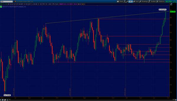
Are hedgers shorting this parabolic move? Not according to:
- Friday – Jason Goepfert @sentimentrader – Dollar ($DXY) hedgers decide against covering
shorts into the rally; move to new record against it. pic.twitter.com/i3jSYaHhyi

There is no shortage of Dollar bulls today. But who was bullish back in May 2014? read what J.C. Parets tweeted on Friday, May 9:
- “J.C. Parets @allstarcharts – an explosive US Dollar rally here would catch so many people off guard. It would be so awesome $DX_F $UUP a lot of dollar haters out there! “
- “J.C. Parets @allstarcharts – after hitting 2yr lows, US Dollar Index reversed & went out at highs. Weekly candle also beautiful. Is this beginning of epic squeeze? $DX_F”
This Tuesday, Parets went the other way in his conversation on BNN. Regarding the Dollar, he said simply:
- Dollar – opposite today to May – too much overhead supply, too much optimism, time to call it a good trade and move on; –
4. U.S. Treasuries
Back on Friday, September 12, Larry McDonald of NewEdge said on CNBC Closing Bell:
- “I think the 10-yr is a screaming buy here … I think next week the slack in the labor force is gonna force Janet Yellen to increase her dovish position; I think US 10s can go back to 2.30% over the next 6 months;”
Since that call, TLT is up 2.3% & the 30-yr/10-yr yields have dropped by 12 bps/8 bps resp. This Thursday, McDonald reiterated his call for 2.30% 10-year yield on CNBC Futures Now
- “China & Europe are about $30 trillion of global GDP; if you look at commodities, & if you look
at inflation in Europe, you have a substantial slowdown; Goldman Sachs lowered Chinese GDP outlook this morning; so much of the world’s economy is slowing; overall, Treasuries are being bid over the last couple of months, because of this global economic weakness,”
The entire treasury curve rallied this week in a bull flattening with the 30-5 yield spread falling by 5 bps & the 30-10 yield spread falling by 2 bps to 69 bps. This is a dramatic flattening from the QE days when the 30-10 year spread remained above 100 bps for the duration of Bernanke’s QE. The 30-10 year spread is one of the best indicators of inflation expectations. So its flattening is powerful evidence of the view that slowdown in Europe-China & Latin America is causing inflation to fall in America.
So either Chair Yellen will end up pushing rate hikes later or the upcoming economic data will cause the yield curve to steepen.
5. Equities
Despite the impressive rally on Friday, all major indices fell this week with Russell 2000 falling nearly 2.5%. How relevant and accurate was the warning issued by Ryan Detrick on Thursday, September 18?
- “Next week is the 38th week of the year (avg return = -0.59%). Might not mean much to you, but this is actually the worst week of the year for the S&P 500 (SPX) going back to 1950 …. To summarize, there isn’t a worse day to buy and hold for five trading days than September 19“
Next week is the 39th week of the year and, according to Detrick, it “is the 10th worst week of the year“. he is worried about seasonality & in his article Is The Weakness In Stocks The Start Of Something Bigger?, Detrick expresses worry about the next two charts of his:
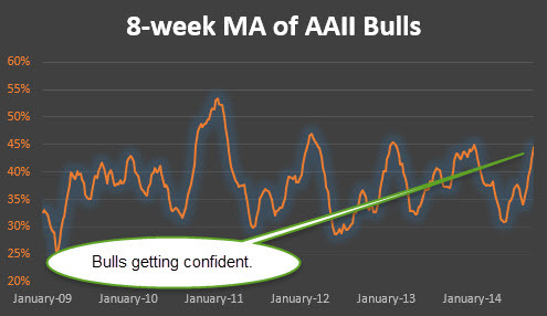
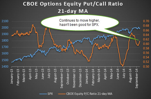
- “First up, the average investor is rather bullish.”
- “Next up, one of my favorite sentiment indicators is the CBOE options equity put/call ratio. … it once again is flashing warning signs. Looking at it now, the 21-day moving average has officially rolled higher over the past week. As long as it keeps pointing higher, caution is my best advice
When would it be a safer time to buy? Detrick writes:
- “The average year since 1950 peaks on September 19 and doesn’t form a major low
again till October 26. Wouldn’t you know it, but this year we peaked on September 18. Could it take another month till we can form a tradeable low? History says that could be the play“
This is consistent with what Tom McClellan wrote on Thursday:
- “The end of September is when the seasonal weakness is due to end, but that is not the
same thing as the point when the seasonal strength is due to begin. The standard period
of calendar strength lasts from November through April, and it typically starts from an
inflection point equating this year to around Oct. 27. Between now and then we should have a great environment to “trade” in, but not yet one to “invest” in. That point will come in about another month”
All this is fine, but what about next week? Wasn’t Thursday a 90% down volume day? And aren’t such days good buy signals? Yes but with one catch, explains Dana Lyons of J. Lyons Fund Management. The catch is “90% Down Volume Days that were initiated from within 1% of a 52-week high”. As Lyons writes;
- “So overall, particularly in the past 2 years, returns following 90% Down Volume days have been exceptionally positive. The only caveat is that those occurring from within 1% of a 52-week high, like yesterday’s did, have actually led to subpar returns“
Dana Lyons also described an indicator for a longer term decline in the stock market in his article The Most Important Trendline In Equity Land: New Highs-New Lows. The article is interesting and discusses the message of the chart below:
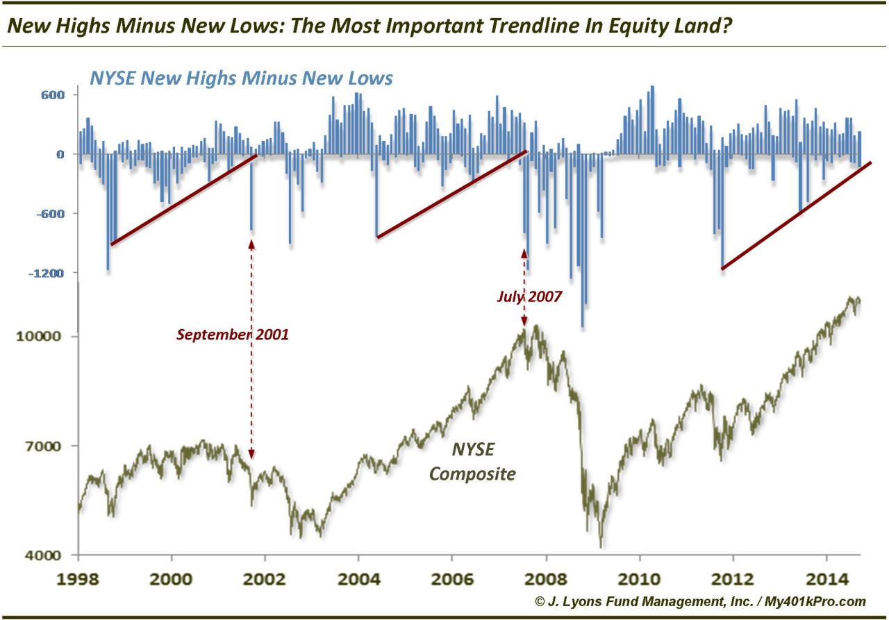
Lyons concludes in his article:
- “It has paid and will likely continue to pay to avoid becoming too bearish from a longer,
cyclical-term perspective until this uptrend line breaks. It will likely do so into a “warning shot” sell off as in 2001 and 2007. That is, it will occur into a sharp pullback that, while perhaps too late to warn of that concurrent weakness, will provide a warning that the longer-term picture has changed, for the worse.”
Below is an interesting tweet & chart about a key sector:
- Friday – TheNorthman @NorthmanTrader I’m not saying this was a top in the trannies,
but that is one hell of a monthly topping candle.. $TRAN pic.twitter.com/sYgVm11sZT

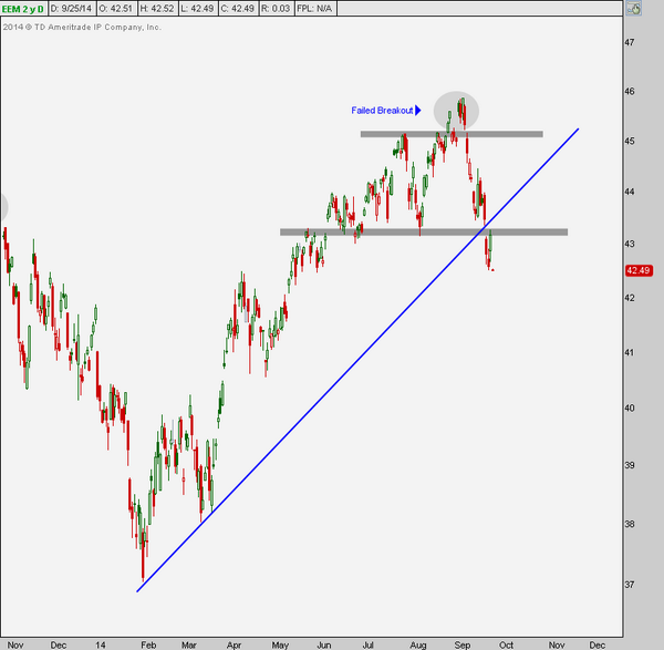
The rally in the Dollar has been terrible for the relative performance of emerging markets. Below are two quick views of EM:
- Urban Carmel @ukarlewitz – One beneficiary of (eventual) DX cool off is EEM pic.twitter.com/0DULXQv5pf Chart from Hong Kong Post
(http://tmblr.co/Zyun3q1RkDKyI ): pic.twitter.com/1skxX5Yi1D
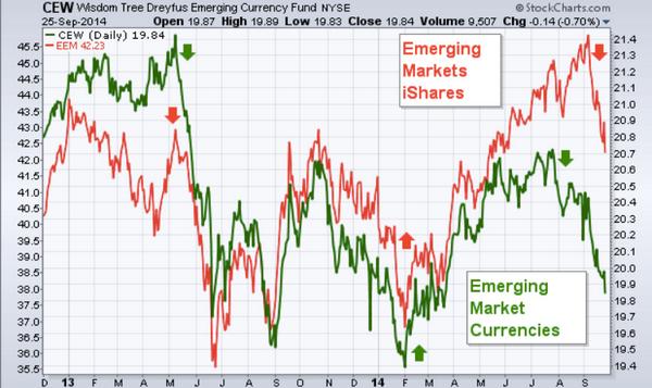
Is below why they say beauty is in the eye of the beholder?
- Friday – J.C. Parets @allstarcharts – Look at Emerging Markets collapsing after putting in that failed breakout this month. Isn’t that beautiful? $EEM pic.twitter.com/2Nw4eZRBdL
6. New York
Why do those terrorists hate NYC subways? It is not as if they have to take the 4 or 5 train every morning. This has been some week with the terror threat, the stock market sell off, Derek Jeter mega event & the NY Football Giants wiping out NFC East pretenders from Washington DC. This is a week to enjoy a quintessential NY clip about Pizza & Trump that was tweeted out by J.C. Parets:
Send your feedback to editor@macroviewpoints.com Or @MacroViewpoints on Twitter