Summary – A top-down review of interesting calls and comments made last week in Treasuries, monetary policy, economics, stocks, bonds & commodities. TAC is our acronym for Tweets, Articles, & Clips – our basic inputs for this article.
Editor’s Note: In this series of articles, we include important or interesting Tweets, Articles, Video Clips with our comments. This is an article that expresses our personal opinions about comments made on Television, Tweeter, and in Print. It is NOT intended to provide any investment advice of any type whatsoever. No one should base any investing decisions or conclusions based on anything written in or inferred from this article. Macro Viewpoints & its affiliates expressly disclaim all liability in respect to actions taken based on any or all of the information in this article. Investing is a serious matter and all investment decisions should only be taken after a detailed discussion with your investment advisor and should be subject to your objectives, suitability requirements and risk tolerance.
1.Anniversary Greetings
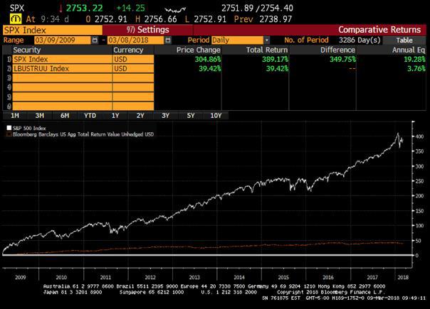
Friday marked the 9 year anniversary of the 2009 bottom in stocks – named by CNBC as the Haines bottom after veteran anchor Mark Haines. Different people greeted this anniversary differently:
- Richard Bernstein @RBAdvisors – Today is the 9th anniversary of the bull market. Stocks have outperformed more popular bonds by > 15% PER YEAR!!!
- J.C. Parets @allstarcharts – so Technology, Broker Dealers, Semiconductors, Regional Banks and the Internet Index are all hitting new all-time highs today. Let me ask you, are these things we normally see in uptrends or downtrends? We don’t have to complicate this.…
$XLK$SOX$IAI$KRE$FDN
A tongue in cheek anniversary greeting:
- Sven HenrichVerified account @NorthmanTrader – Congratulations to
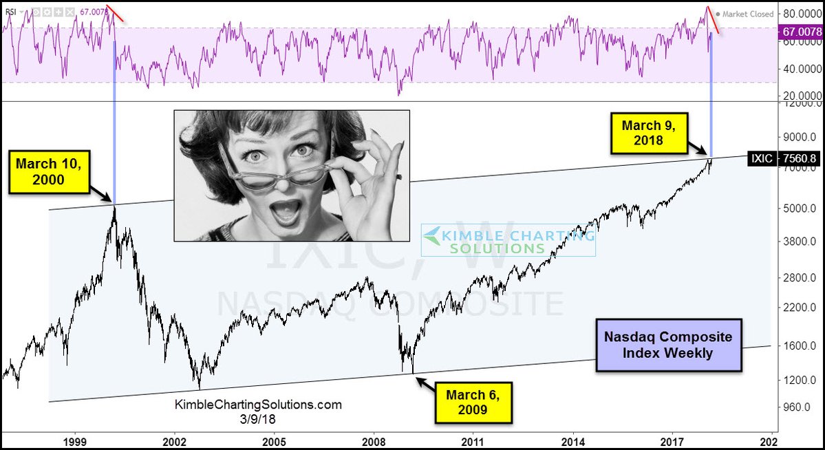
$NDX for making all time highs on March 10, 2000 and March 9, 2018
How is this expressed in a chart?
- Chris Kimble @KimbleCharting – Don’t see this often
$NDX$QQQ$IXIC$SPY
 Speaking of the technology sector:
- Lawrence McDonald @Convertbond –They Love Tech
$XLK 2018: $71.25 (all-time high) 2002: $11.50 (They hated Tech) *The fund saw almost $620m in inflows on Thursday, the most since December 2011, Technology Select Sector SPDR Fund. Nearly $25B is now in this ETF.
This is a big moment indeed. Is this a real breakout for NDX above its 2000 high or is it a double top? Or is what happened on Friday an expression of what “perfect” looks like?
But before perfection, what about next week? One said:
- Thomas Thornton @TommyThornton – Adding April Puts here at close SPY 274, QQQ 170, IWM 157 – 2.5% weight between all of them. Small size
Another:
- J. C. Parets @allstarcharts – Look at that weekly candle in Industrials. Setting up for an outside week, bullish engulfing. Same thing in the Dow Jones Transportation Avg
$XLI$DJT$IYT
2. Three Positive Signs from Last Week
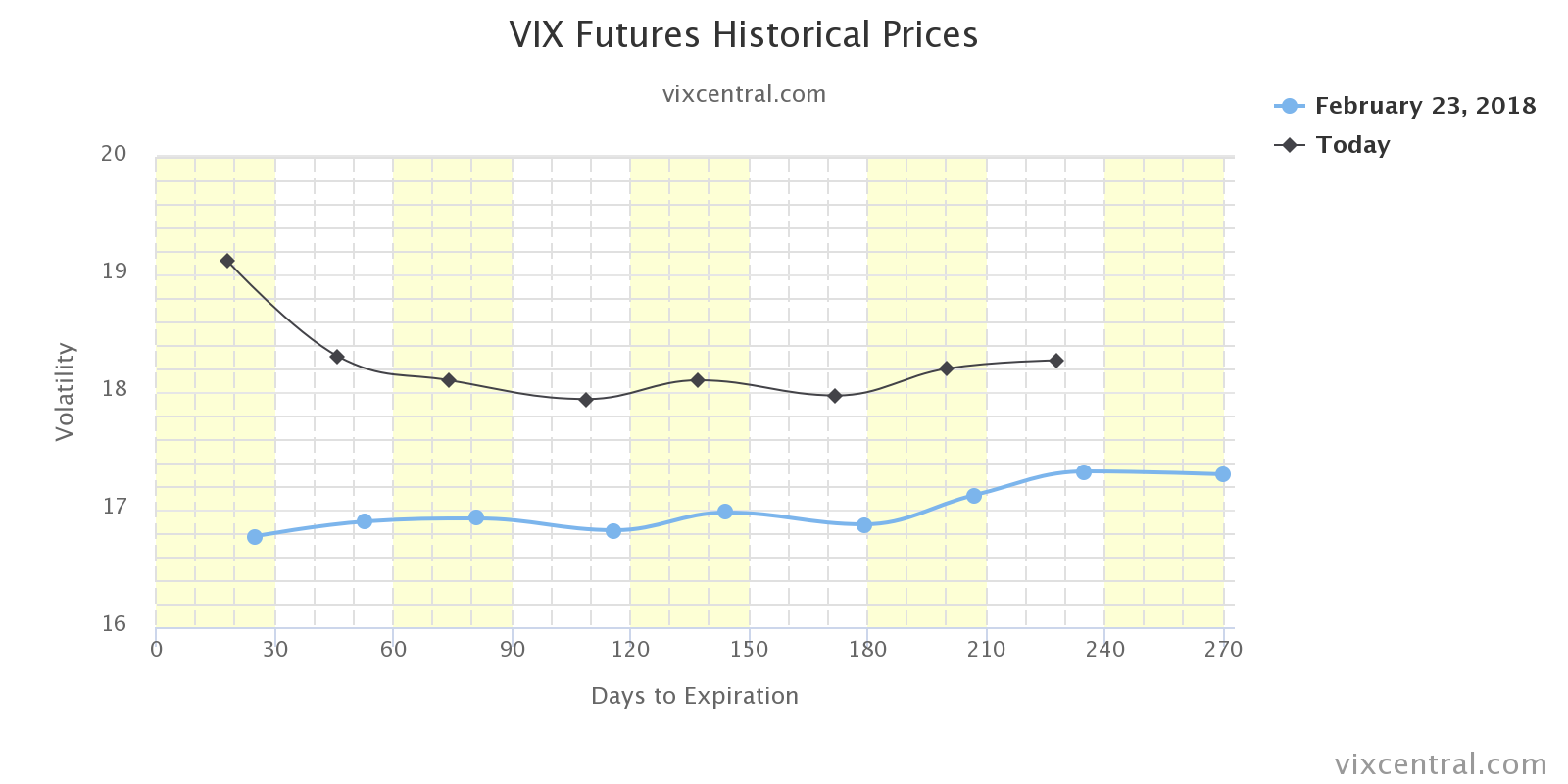
The mood was somewhat dark at the end of last week, with Trump tariffs and all. But last week also threw up 3 positive signs, the first being the inverted VIX curve. Below is the curve on March 2:
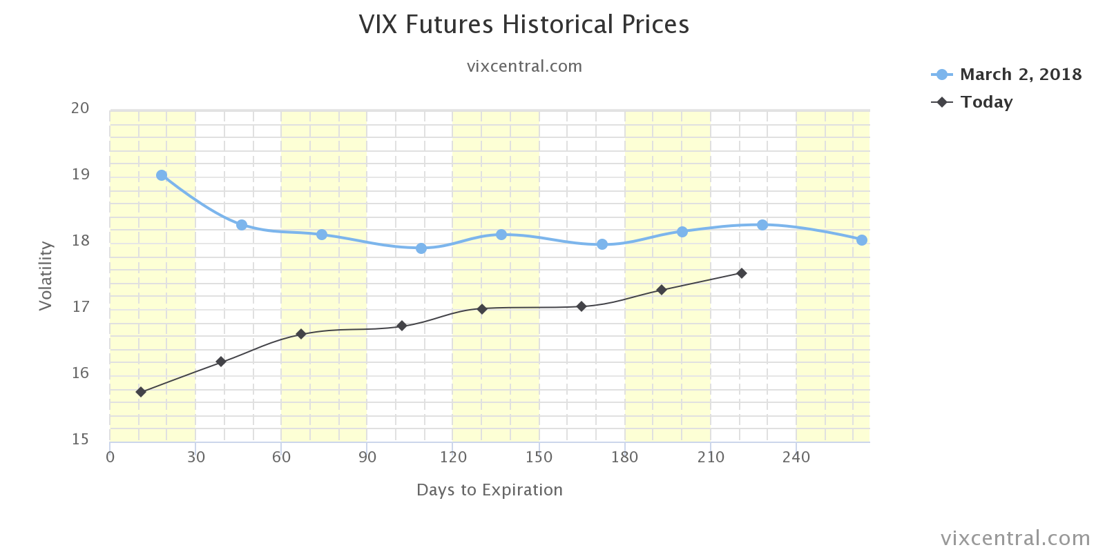
What does it look like now?
So we wonder how much the impetus from fall in the VIX is left? The second positive sign was last Friday’s bullish divergence between small & micro caps and the big SPX & Dow Jones. This week was much more balanced with all indices up 3+-4+ percent. The third positive sign was a media-based signal:
- Chris Kimble @KimbleCharting – March 2 – Markets often close to short-term Lowe’s when CNBC ask Ron to come on TV
Our sincere thanks to both CNBC & Ron Insana for that signal. But we don’t have that for next week. So all we have left is momentum and “perfection”.
3. Perfect – Peak or a step to greater heights?
How did David Rosenberg summarize the 313,000 NFP number on Friday morning?
- “Perfect numbers are a rarity, to say the least, but today’s employment report has to be considered a candidate”
But his later tweets painted a less perfect picture:
- David Rosenberg @EconguyRosie – The birth-death model added 76k seasonally adjusted jobs, like a wave of the magic wand. Adjust for this guesswork on the part of the BLS, and the headline NFP number would have been a more consensus-like 237k instead of 313k.
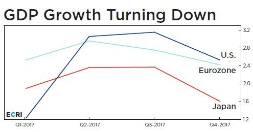
That brings us to our title question. It was not a question at all to ECRI which called this The Global Economy’s Wile E. Coyote Moment:
- The chart below shows that quarter-over-quarter annualized gross domestic product growth rates in the three largest advanced economies — the U.S., the euro zone, and Japan — have turned down. In all three, GDP growth peaked in the second or third quarter of 2017, and fell in the fourth quarter. This is what the start of a synchronized global growth downswing looks like.
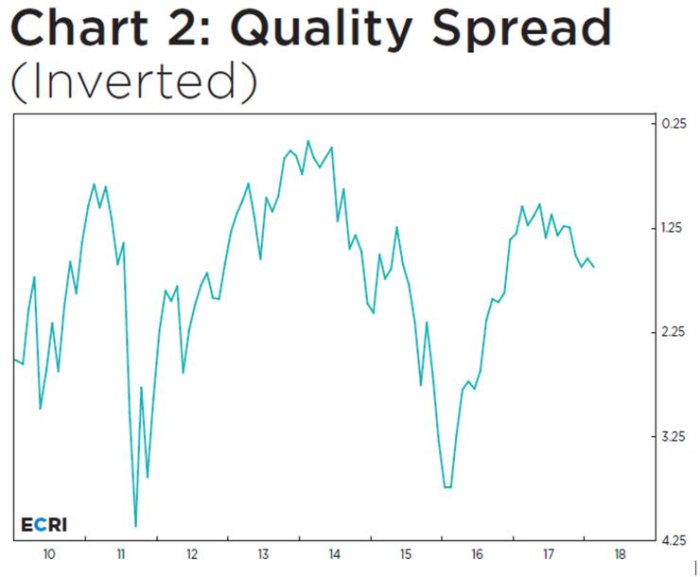
- Specifically, the quality spread — the difference between the yields on junk bonds and investment-grade corporate bonds — has been widening for several months.
- All of this suggests that the consensus is again playing catch-up on the cyclical outlook, while international central banks, concerned about overheating, are even further behind, and mistaking last year’s synchronized growth upturn for a structural shift toward a “normal” economy. Of course, hawkish shifts in the face of economic slowdowns that policy makers don’t see coming rarely turn out well for the economy.
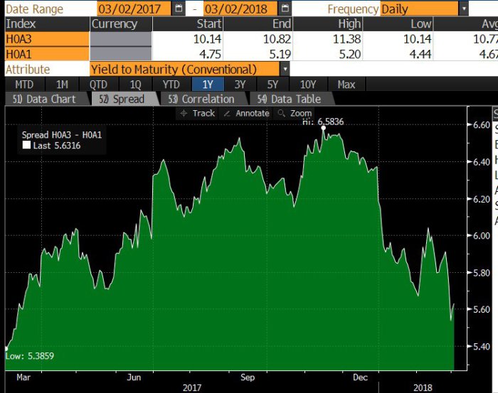
But is a short term bounce in high yield likely, as we wondered last week?
- Lisa AbramowiczVerified account @lisaabramowicz1 – Despite recent weakness in U.S. equities, there are growing signs of strength in the high-yield bond market. The lowest-rated junk bonds have rallied more than the highest-rated ones, with the yield gap between the two tiers of notes narrowing near the lowest since March 2017.
4. Treasury Yields
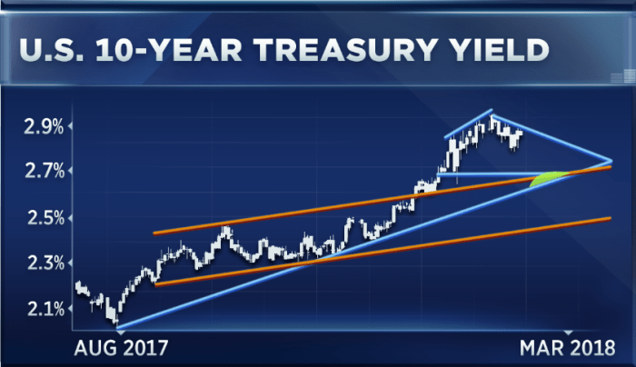
The month old hard & fast correction in stocks had two triggers – VIX explosion & fast shoot up in Treasury yields driven by the scare of 2.9% yr/yr wage growth in the Non Farm Payroll report on February 9. The VIX explosion has now been virtually extinguished. But what about Treasury yields?
Like the dog that didn’t bark, the 10-year Treasury yield was fairly well behaved on Friday despite the strong NFP report and the ebullient 440 point rally. The yield did pop above 2.90% but it came down quickly and closed at 2.89%, thereby maintaining the 2.80% -2.89% range. That was attributed to the 2.6% yr/yr wage growth of this NFP report. But not every one is relieved:
- David Rosenberg @EconguyRosie – Pundits are wrong to conclude that wages were benign in today’s payroll report. Average hourly earnings for 80% of the workforce rose a healthy 0.3% and over a 3% annual rate in the past three months. In the goods-producing sector, wages have jumped at over a 5% pace. <1/2>
Sadly, Mr. Rosenberg doesn’t know that the correct spelling of the Sanskrut word is “Pandit” or that “Pandit” is a reasonably common last name in India that signifies the family profession was being Pandits. But moving on:
- David Rosenberg @EconguyRosie –Manufacturing, construction, transportation & warehousing are all seeing wage breakouts. <2/2>
Can the 10-year Treasury yield stay below 2.90% with such wage growth? But what is the message of inflation expectations?
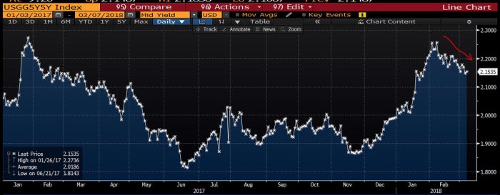
- Lisa AbramowiczVerified account @lisaabramowicz1 – While inflation expectations over the next five years are increasing, they’re ticking down slightly over the next decade. https://twitter.com/FullyProfi
table/status/97138957088034406 6 … Rather, while trade tensions & tax cuts may boost inflation now, they’ll likely slow growth longer term. 5y5y forward breakevens:
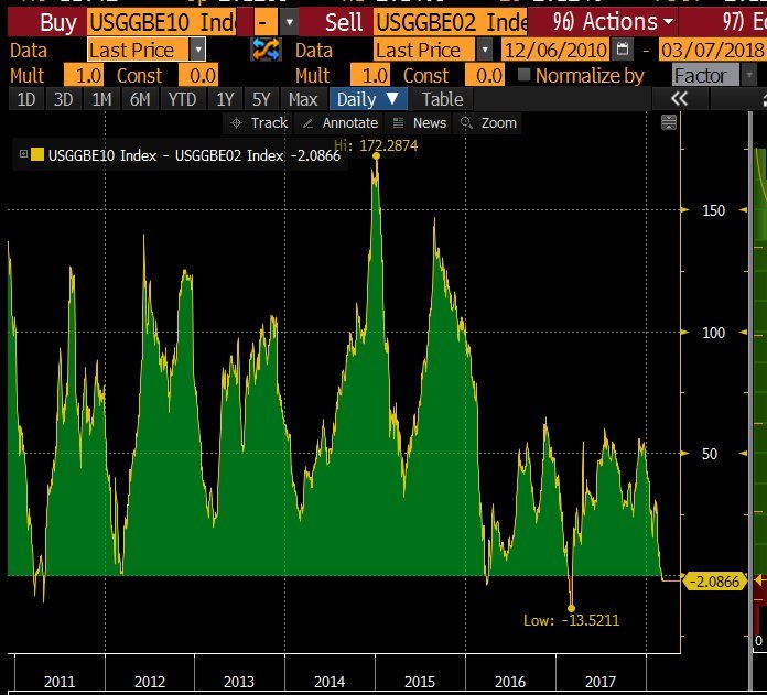
 Also check the message of this gap inverting:
- Lisa AbramowiczVerified account @lisaabramowicz1 – The gap between 10 and 2-year breakeven contracts has inverted for the fourth time since 2010.
That sounds nice but is there any technician bold enough to call for a decline in Treasury yields? Paul Ciana of BAML actually did so on Tuesday on CNBC FuturesNow:
- “I have about six reasons in total from a technical perspective to be at least counter-trend bullish bonds right now,”
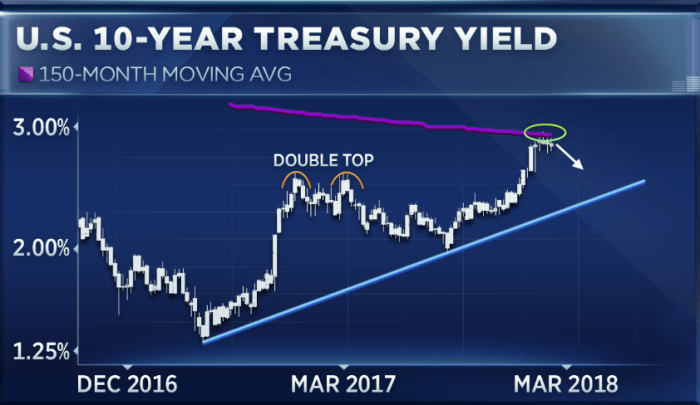 His six reasons seem to the following:
- Yields have risen to touch their 150-month moving average, a move not seen since 2007 when yields peaked.
- “The RSI of the weekly 10-year yields chart is hovering at about 74, which means yield is overbought or the bond market is oversold to a rather stretched position and could correct,”
- Momentum also appears to be slowing down …
- the “sell yield, buy bond signal” is at its peak this year.
- The setup on the bonds market also looks similar to how yields traded last March. At that time, the 10-year yield formed a double top, trading at 2.6 percent to 2.7 percent before declining to 2 percent….
- “The MACD indicator on our daily chart has already crossed lower, … It’s pointing to lower yields and and has plenty more room to trend lower before it truly crosses that zero line.”
What is his stop for this trade?
- “If we start to creep above 2.95 [percent] and start making new yield high this year, that probably means this counter-trend bounce isn’t working or is already over,”
Well, one bad inflation number could propel the 10-year yield above 2.95% & stop out this trade. On the other hand, what if the 10-year yield falls further if inflation comes in weaker than expected?
What happens to stocks if Treasury yields fall in the near term? Do stocks fall on fears of slowdown in the global economy or do stocks rally with valuations improving because of lower bond yields? Wouldn’t Risk Parity guys buy more of stocks & bonds if yields fall? One said emphatically yes midweek:
- Ben HuntVerified account @EpsilonTheory – Wed Mar 7 – There’s only one possible explanation for why markets aren’t down more on the Cohn news … Risk Parity is buying! By my calculation there is $5 trillion worth of “buying pressure” to be unleashed over next few days. Please alert JPM analyst.
5. Gold & Silver
Neither the Dollar nor Gold-Silver did much this week. Interestingly, we saw divergent opinions on Gold & Silver from the same trader:
First Gold:
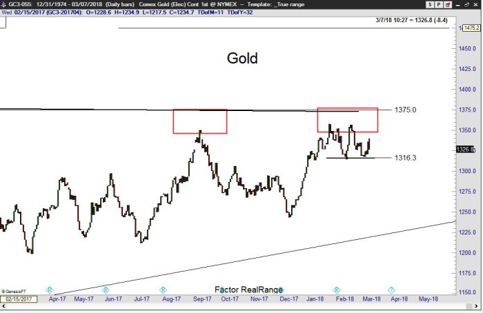
- Peter BrandtVerified account @PeterLBrandt – Mar 7 – A close below 1310 in
#GOLD$GC_F$GLD will be a sell signal for me.
Now Silver:
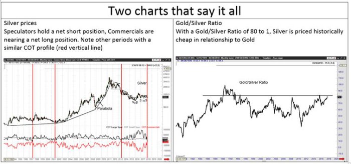
- Peter BrandtVerified account @PeterLBrandt More – Two Silver charts that say it all: Large speculators are net short, commercials are holding smallest net short position in years. Small specs don’t count Silver
$SLV$SI_F is historically cheap in relationship to Gold$GLD$GC_F
Send your feedback to editor@macroviewpoints.com Or @MacroViewpoints on Twitter
