Summary – A top-down review of interesting calls and comments made last week about the flash crash in Treasuries, monetary policy, economics, stocks, bonds & commodities. TACs is our acronym for Tweets, Articles, & Clips – our basic inputs for this article.
Editor’s Note: In this series of articles, we include important or interesting Tweets, Articles, Video Clips with our comments. This is an article that expresses our personal opinions about comments made on Television, Tweeter, and in Print. It is NOT intended to provide any investment advice of any type whatsoever. No one should base any investing decisions or conclusions based on anything written in or inferred from this article. Macro Viewpoints & its affiliates expressly disclaim all liability in respect to actions taken based on any or all of the information in this article. Investing is a serious matter and all investment decisions should only be taken after a detailed discussion with your investment advisor and should be subject to your objectives, suitability requirements and risk tolerance.
1. Flash Crash in Treasuries?
Rick Santelli has seen far more bond action than we will ever see. And he said he has never seen anything like the incredible collapse in treasury yields on Wednesday morning. The 10-year yield dropped that morning to 1.86% and the 5-year yield to 1.10%. Yields sprung back very quickly but the specter of machines frantically seeking to buy Treasuries everywhere thereby creating a violent waterfall in yields will remain with all of us for a long time. The photo in the tweet below speaks eloquently:
- Toby Nangle @toby_n – 10yr UST intraday yield is one for the photo collection. As whacky as those JGB yield shifts in April 2013 (?)
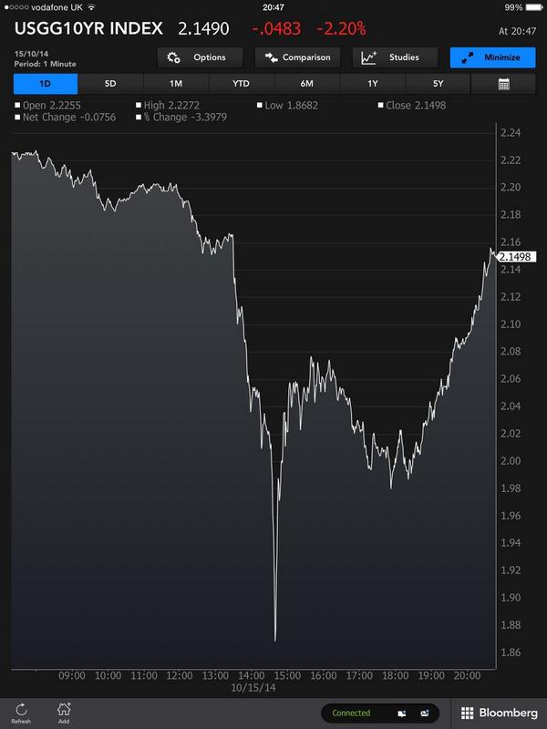
What we saw was massive liquidation of wrongly positioned assets. As soon as the liquidation was finished, yields sprung back very sharply. Rick Santelli said on Friday that the low yield levels of 1.86% on 10-yr & 1.10% on 5-yr will hold up for a very long time.
That seems to be the way to bet unless this yield crash behaves like the equity flash crash of May 6, 2010. The Dow fell by 600 points in 5 minutes that day creating a 1,000 point drop intra-day. Recall that the flash crash intra-day low of Dow 9869.62 was broken by the intra-day low of 9774.68 on May 25, 2010 & by the closing low of 9816 on June 7, 2010. A month later, on July 2, 2010, Dow reached its 2010 intra-day low of 9614.32 & closing low of 9686.48.
Will Treasury yields behave like that flash crash during the next couple of months or did we see the bottom in yields for 2014?
2. Wake up call for Central Banks?
Last week, we described deflation fears as a contagion sweeping the world. The flash crash in yields could be an evidence of the seriousness of the deflation scare in Europe. We have no doubt it woke up the Fed. James Bullard, President of the St. Louis Fed, spoke clearly to Michael McKee of BTV the next day:
- “I also think that inflation expectations are dropping in the U.S. And that is something that a central bank cannot abide. We have to make sure that inflation and inflation expectations remain near our target. And for that reason I think a reasonable response of the Fed in this situation would be to invoke the clause on the taper that said that the taper was data dependent. And we could go on pause on the taper at this juncture and wait until we see how the data shakes out into December”
Coincidentally or otherwise, the stock market rallied all afternoon on Thursday with the S&P closing positive & Russell 2000 closing up 1%. The next day, coincidentally or otherwise, Eric Rosengren, Boston Fed President, dismissed talk about stopping the taper and said that QE is set to end during the next Fed meeting on October 29, 2014.
The real question is whether the Fed will raise rates in 2015 or not. Martin Feldstein emphatically told BTV’s In The Loop viewers that the fed funds rate will rise to 1 -1.5% by the end of 2015. On the other hand, CNBC ex-anchor Ron Insana flatly said on CNBC Closing Bell that “Fed is going to do nothing next year“.
The big question is what guidance will Chair Yellen provide on October 29? Will she get more dovish by diluting the “considerable period” statement, will she simply stay the course, or will she get more hawkish by removing the “considerable period” statement?
3. Cyclical correction in a secular bull market?
Martin Feldstein said on Friday on BTV In the Loop that he doesn’t see “anything in the foreseeable future that looks like a recession“. Rich Bernstein told CNBC’s Becky Quick on Friday that “economic fundamentals that would normally associate with a bear market or recession are nowhere to be seen“. David Rosenberg wrote on Friday that “Bear markets need a recession and that simply does not look in the cards.” This view is also the oft-repeated view of Leon Cooperman. Larry Fink said on Squawk Box this week that those who can stomach the volatility should invest in this stock market.
Rich Bernstein, Larry Fink, and David Rosenberg have been far more right than wrong in the past. And all three explicitly warned investors in 2007 about the dangers they saw in those markets. Those who listened to them in 2007 saved themselves a great deal of money & pain. So we listen when they talk.
4. Signs of something malevolent?
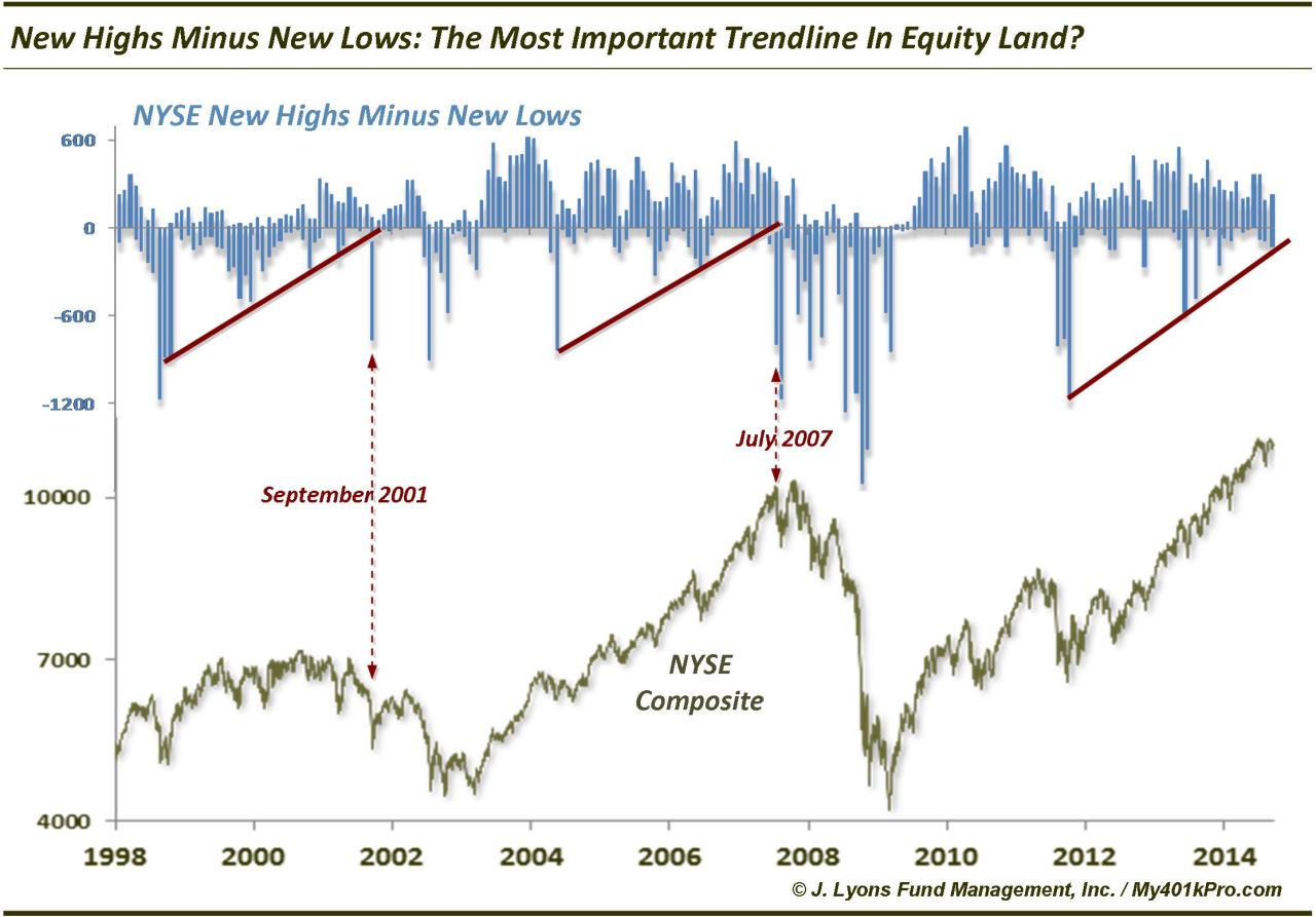
In our September 26 TACs article, we had featured the following chart of Dana Lyons of JLyons Fund Management. He called his chart below The Most Important Trend Line in Equity Land.
This Thursday he UPDATED the above chart as BROKEN.
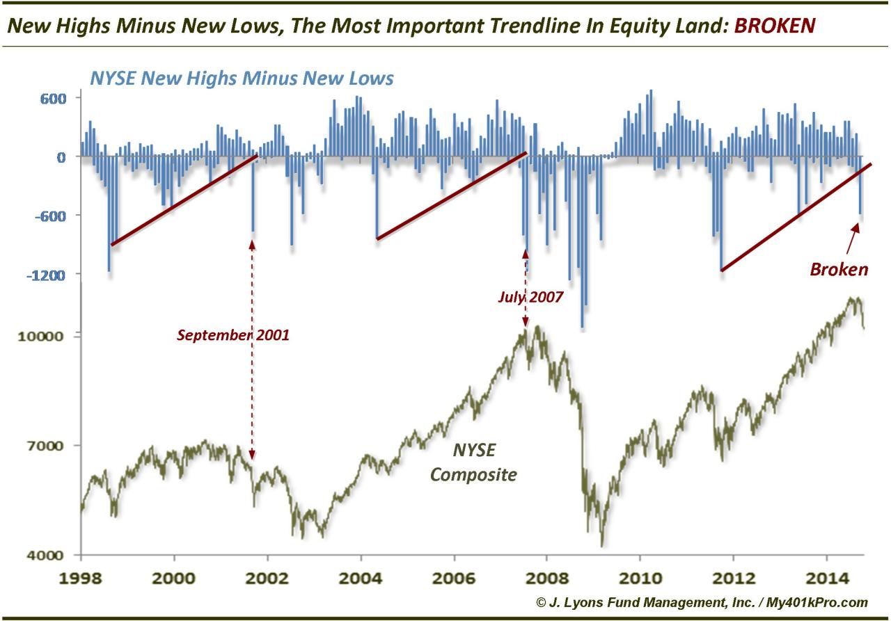
He wrote in his article:
- “the broken trendline is not a short-term concern. … As we pointed out in the September 25 post, the concern has longer-term ramifications. Just as in September 2001 and July 2007, this trend break runs the risk of eventually leading to a more serious cyclical bear market.”
- “So while the market is undoubtedly washed out here in the short-term and will likely form an intermediate-term low within days or weeks, the longer-term cyclical bull has now been dealt a staggering blow.”
Recall that the correction in July 2007 led to a new high in stock indices in October 2007 before the deluge.
Another trader sees a similar pattern evolving. In his article Shades of Grey: 2007 Edition, @NorthmanTrader writes:
- “But it is the larger structure that has us especially curious as this weeks lows appear to repeat a pattern we have seen before: 2007. … Yet, as the 2007 case shows, this initial violent correction off of all time highs can also produce new highs … In 2007 it took a mere 8 weeks from the initial shock. This shock, incidentally came with a large spike in the $VXO following a long dormant period”.
- What could we expect on a repeat? A move back toward the middle Bollinger band, new highs and then a vicious bear market into 2015.
- But it’s just a scenario and we still have to trade what’s in front of us. And this market has shown to be very different than any previous QE correction as evidenced by the deep drop in high/lows which now mirrors that of the 2008/2009 financial crisis period“
We urge interested readers to read the entire article Shades of Grey:2007 Edition and study its charts. The above is merely a glimpse into the reasoning.
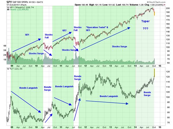
Until now, the powerful hand of the Fed has negated serious chart warnings of famed technicians. But now the hand of the Fed is about to be withdrawn and replaced by verbal guidance. Will that be enough to keep negating technical warnings or will the Fed/Draghi push more stimulus to prevent a roll over in the equity markets?
- Friday – Jesse Felder @jessefelder Look at this chart and tell me again how the markets trade on fundamentals rather than the Fed
5. Short-term Views
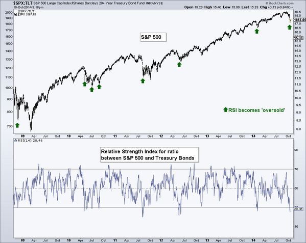
It is interesting that both the articles featured in the above section suggest another spike up to new highs. Does that mean stocks are now better than bonds? Yes, says the tweet below:
- Thursday – Andrew Thrasher, CMT @AndrewThrasher The ratio between stocks & bonds is now ‘oversold’ and has led to prior bounces in in the S&P 500 .
 He wrote in his article:
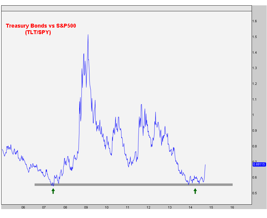
- A chart that we brought up back in May was the US Treasury Bonds vs S&P500 ratio when it first approached the 2007 lows. I think where we stand today, this chart looks even better than it did then. Granted it’s up 10%, but still.So far we are bouncing nicely off this support and call me crazy, but it seems to me like there’s a lot more upside left: So I think the risk/reward still favors bonds over stocks. I haven’t seen any evidence that would suggest otherwise..
- Larry Altman, the famed trader, said the following (in summary) on CNBC FM 1/2 on Thursday – “this week’s lows will hold for a few weeks; looking to buy dips“. But his longer term outlook is very different – “I think the S&P will eventually finish at 1600, near 1580 somewhere; I think the bull market is over for the time being until we get back to that old high, that 1580 high & find out what’s there “.
- Carter Worth on CNBC Options Action on Friday – “Sell S&P at 1900″
- Mark Newton on CNBC FM on Thursday – “sell bounce to 1900; need TRIN >2 & more fear; but close > 1940 will negate; 2-yr trend line broken; short term oversold; energy made a very good reversal; but weekly momentum to lowest level”
Speaking of the vicious rally in energy, especially XLE-OIH, Larry McDonald deserves kudos for his call and explanation on CNBC Closing Bell on Tuesday:
- From a trading perspective, after a great bull market run, the great bull market run oils & oil services have had, that first leg down, the rally that you can get off of that can be spectacular; we have a 7-factor model that measures capitulation, there is a mathematical formula behind it, we are reaching capitulation fatigue; this may not be the bottom in oil service names & oil names; but you can easily get a 12% rally in a bear market & then retest these lows again; I am not going to pass up on that”
The stock rally on Thursday afternoon & Friday morning was indeed led by XLE & OIH. To his credit, McDonald took partial profits on the XLE & OIH trades on Friday afternoon. By the way, he is among that rare breed who are bullish on Gold Miners.
To our simplistic way of thinking, the vicious rally off the lows was led by Russell 2000 which outperformed the S&P for 3 straight days. It was the one major index that was up 2.75% this week. But on Friday morning, it began to lose its rally and actually closed down on the day. And the S&P rally failed at 1900 on Friday and then closed below the 50-week moving average. Is this action worth noting or are we being fanciful? We will find out on Monday.
Until then, those who follow Art Cashin should marinate ice-cubes this weekend while purists like us will drink straight up.
Send your feedback to editor@macroviewpoints.com Or @MacroViewpoints on Twitter